March, 2005, pp 210-213
Ugo Rondinone, etc.
(translation)
For the November 28,
2004 "Arts and Leisure" section of the New York Times, Roberta
Smith offered her annual take on the art world. Entitled "Chelsea
Enters Its High Baroque Period," the critic eschews the numerous
and repeated complaints levied at that part of Manhattan's grid falling
between 14th and 29th Streets, west of 7th Avenue. Where some artists,
dealers, communities, and critics increasingly worry over what they see
as the onset of homogeneity, mediocrity, and commerce-even an insidious
return to conservatism- Smith opts to cast her oppositional, if not wholly
surprising, vote of confidence: "Chelsea is a delight," she
gushes, "a carnival without equal, the greatest showplace for contemporary
art on earth-and never more so than right now, as the gallery count rises
faster than ever."
Such a privileging
of rapid growth and multiplication (a section of Smith's piece is aptly
titled "Do the Math" and opines, "If one gallery is good,
two or three are even better) is not wholly unfounded. Better, one imagines,
to see people clamoring for art than turning their backs on it. And yet,
one wonders-taking Chelsea as simply one limit case-how a shift in understanding
that posits more as an indicator of quality affects not only gallery spaces
but the art being shown, to say nothing of its audiences. Indeed, one
has only to look at the kind of spaces that epitomize Chelsea (a majority
of them designed by a single architect-Richard Gluckman)-gutted, sterilized
warehouses that often "wow" much more than anything hanging
on the walls there.
If it sounds as though
I am about to launch down the by now familiar path of Chelsea-bashing,
don't despair. As Smith points out, Chelsea is hardly occupied by only
Gagosian-size gallery spaces, and even such behemoths occasionally show
wares that not only stand up to their sites but literally render them
irrelevant (a recent, if counterintuitive, example at Gagosian was a breathtaking
DeKooning show). In addition, all manner of small- to mid-size galleries-Metro
Pictures and Murray Guy among them-not only continue to open but, perhaps
more impressively, to persist (often having themselves tracked the western
migration from Soho or the East Village). Yet, the significant closing
of spaces like Pat Hearn and American Fine Arts in the last years is devastating
and impossible to quantify, particularly because these spaces far exceeded
their ostensible functions; worse, such endings hardly resonate for a
majority of gallery-goers who, while imagining they enter a community
by cocktailing at Lot 61, have no need for history since galleries seem
to magically multiply all around them.
All this to say that
Smith's use of "High Baroque" with regard to Chelsea is curious.
When I think the term, I'm happily recalled to Bernini, though I'm somewhat
sure this isn't what Smith had in mind. The word baroque is generally
used to connote effusive recourse to ornamentation and choreographed tension-whether
in the plastic arts, music, or architecture. And yet its etymology from
the 18th century (and arguably even earlier) links it to irregularity
in objects as unrelated-and as particular-as pearls, teeth, and warts.
Such idiosyncratic examples would seem to site the baroque, at least initially,
in the eccentricity of superficial details, whether of an individual or
an entire building. In addition, the "baroque" can be thought
as the theatrical staging of difference: and this not necessarily a pleasing
pose.
Smith's description of Chelsea as a carnival, then, would seem to coincide
neatly with her invocation of the Baroque, given that both can be seen
as celebrations of and by way of exaggeration. (It bears blatantly overdetermined
mentioning that the etymology of "carnival" is in fact nearly
identical to that of "carnivore.") But, my love of Bernini aside,
there are less benign, shallow, conceptions of the Baroque to be had.
Walter Benjamin, for instance, in his early work, The Origin of German
Tragic Drama, held the Baroque to be inextricably linked with a kind of
shortsighted, melancholic tethering to the world. Continued recourse to
extravagant physical details and settings meant that time itself came
to be conceptualized differently. Rather than retaining an abstract, and
therefore anticipatory relationship to historical time, people became
literally grounded, bound in a relationship to time that took on spatial
dimensions. Benjamin described this Baroque conceptualization of history-one
that bred passive melancholy rather than a will to act or produce-as resonant
with the later effects of capitalism.
It seems, then, at a moment where Chelsea seems to quite ceremoniously
perform a privileging of space over history, there is no arguing with
Smith's assessment, even while deeply disagreeing with her terms. Chelsea
has hit a Baroque moment (though I would argue "neo" rather
than "high"). Where the forces of community, politics, and art
history were visible everywhere in the art spaces of ten years ago, every
exhibition mounted these days feels sprung from a sparkling tabula rasa.
And so, it is, indeed, the space that we experience rather than any context
for it. (Benjamin wrote that in the Baroque "chronological movement
is grasped and analyzed in a spatial image.") To this end, one might
argue, most of the spaces we come to view art in (these getting grander
by the minute-museums like MoMA make Gagosian look piddly) can never really
be occupied so much as filled.
And, to get to the
review part of this essay, this is hardly the case only for audiences
who, weaving from doorway to doorway, make their way from one space to
another. Indeed, artists are called upon increasingly to make work that
itself has a more spatial than historical relationship to time. One particularly
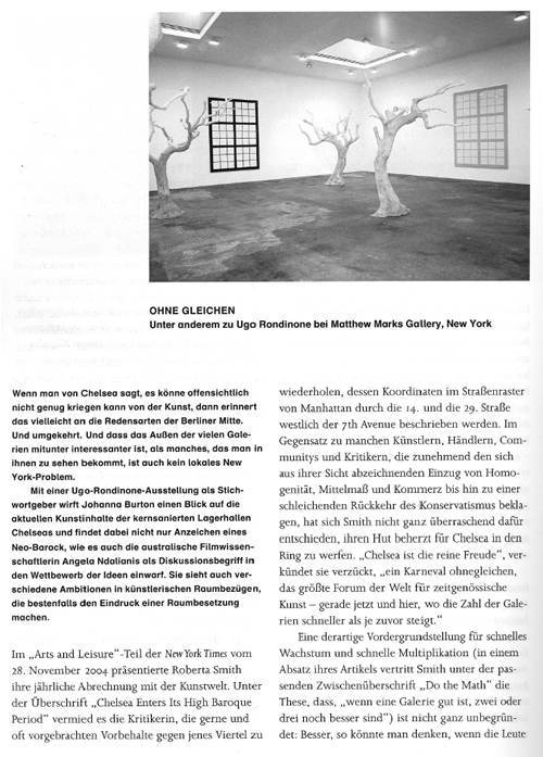
Baroque (in this regard) recent exhibition was by the Swiss artist Ugo
Rondinone, his third solo show at the largest of Matthew Marks's Chelsea
spaces (out of a total of three.) I am a cautious fan of Rondinone's work
but this exhibition-one that approximated a pop-up fairy-tale book through
which I was ostensibly invited to wander-was a picture perfect rendition
of the Baroque I've outlined here.
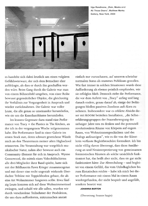
Comprising a rainstorm made of chain link, a post-and-lintel forest, a smattering of gigantic black-cast masks, resin trees, and three windows revealing only the walls, Rondinone's exhibition was titled Long Gone Sole. Though homophonic wordplay was clearly intended by the artist, it is uncanny the degree to which the phrase "Long gone soul" so better expresses how Rondinone's constructed space operated. Indeed, there was something whimsical and uncanny and even very sad about the installation, and yet this was a vulgar mix of emotions that seemed to force itself upon viewers rather than being produced by them. Walking through the gallery was to be surrounded: by a stage set, by so many willfully antipodal objects that at once announced a relationship to the past and yet rescinded it. The gallery was full of other people; we all walked around each other just as we did the resin trees.
A study in contrast: This week, I went to a performance at The Kitchen by Tracy + The Plastics. Carried out in an upstairs gallery whose painted black walls reminded me of my high school theatre, the piece was ostensibly musical in nature, but it self-consciously touted a communal element as well. Wynne Greenwood, who by way of a video screen plays all three members of her band, had teamed up with a sculptor, Fawn Krieger, to build a rather dumb looking carpeted bleacher that was meant to approximate a living room. About fifty people could squeeze onto this living room island, and from the moment we were all seated, we were made aware of our own normalized mute status as spectators, asked by various participants of the production to join in rather than sit back. As is almost always the case in such situations, this was both embarrassing and a failure. And yet, the performance-which began before and lasted after "Tracy" ever took the stage-was meant precisely to shore up some of the conditions of passive spectatorship.
More particularly, the installation, called ROOM, was conceived to "re-imagine the consciousness raising groups of the 1970s feminist movement and the potential revolutionary spaces of close bodies, living room histories and dialogue," as the accompanying brochure written by the artists puts it. I'm not fully convinced that this "re-imagining" of communal feminist spaces worked as such, but that doesn't mean it didn't work. For a change, and accompanied by a sensation that ranged from uncomfortable to ecstatic, I was in a room not filled but occupied.
-Johanna Burton


